A good flyer design does one thing brilliantly: it grabs attention and moves people to act. In this guide, I’ll share practical flyer design ideas, a proven flyer design inspiration layout, and creative angles from cool flyer styles to art flyer concepts so you can craft pieces that stand out on walls, feeds, and inboxes.
Get a pro to design your flyer (fast turnaround) →
Why Flyers Still Work (and Where They Win)
Flyers shine when you need quick reach and clear messaging events, launches, promos, openings, and community campaigns. They’re affordable, easy to distribute, and repurpose beautifully for social posts and stories.
Make yours: one audience, one offer, one action.
Hire a freelance flyer designer who gets your niche →
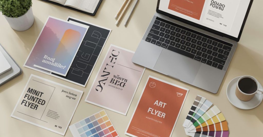
Flyer Design Inspiration: 6 Styles That Convert
Use these style buckets to steer your creative direction (or your designer’s brief).
- Minimal Impact – Big headline, lots of spacing, one striking image.
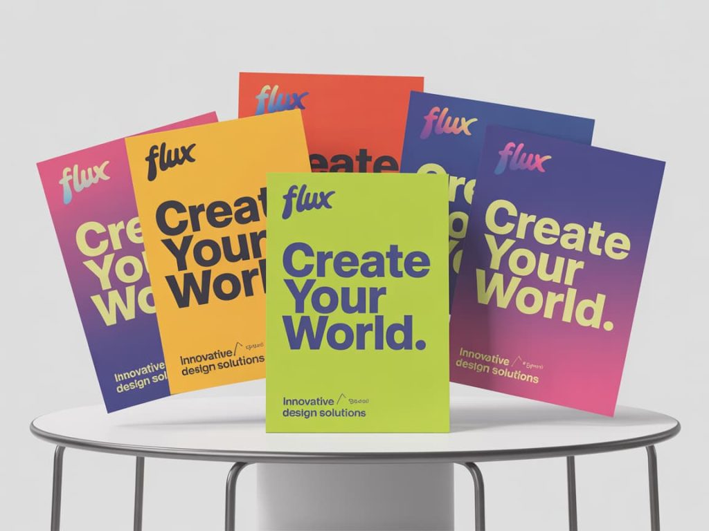
- Bold & Colorful – Saturated backgrounds, oversized type, gradient accents (cool flyer energy).
- Editorial Chic – Grid-led, typographic hierarchy, refined palettes.
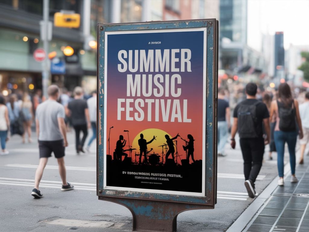
- Photo-Forward – Full-bleed hero image + tight copy; perfect for venues and events.
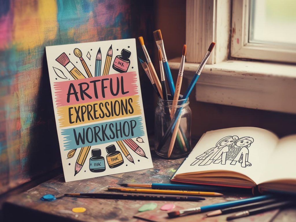
- Illustrated / Art Flyer – Hand-drawn or vector illustrations for indie, gallery, and creative events.
- Retro/Analog – Riso textures, halftones, grain; great for markets or music nights.
Want three custom moodboards for your brand? Request concepts →
Flyer Design Inspiration Layout (Copy/Paste Framework)
A reliable structure you can reuse across campaigns:
- Top strip: Logo or host name
- Hero hook: 3–6 word headline that sells the benefit
- Proof or teaser: Short line, icon, or date badge
- Details block: What, when, where, price (use icons for scannability)
- CTA: “Book Now,” “RSVP,” “Scan to Register” with a clear button/badge
- Footer: Socials, URL/QR, tiny disclaimers/partners
Get a custom layout built in your brand system →
Typography & Color: Tiny Choices, Big Results
- One hero typeface for headlines, one workhorse for body.
- Track headlines slightly tighter; increase line-height for body for readability.
- Choose a 2–3 color palette; add one high-contrast accent for the CTA.
- Test on dark and light backgrounds print and social crops behave differently.
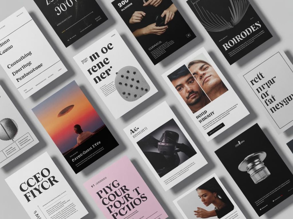
Imagery: Photos vs. Illustration
- Photos: Use one powerful image. Crop for action and emotion.
- Illustration / Art flyer: Use bold shapes, limited color, and expressive textures to stand out from photo-heavy competitors.
- Poster design crossover: When a flyer must double as a poster design, favor vertical orientation, stronger margins, and a headline that reads from 2–3 meters away.
Need bespoke illustrations or licensed photos included? Book an all-in-one designer →
Cool Flyer Tricks (That Pros Use Quietly)
- Add a date circle or corner ribbon to create urgency.
- Use overlays (subtle gradient or noise) to unify type and image.
- Place a QR code near the CTA never hide it in the footer.
- Design a square or 4:5 variant for instant Instagram reuse.
- Include microcopy below the CTA: “Limited seats • Early-bird ends Friday.”
Flyer Design Ideas by Niche
- Music/Club: Neon gradient, large artist name, high-contrast time badge.
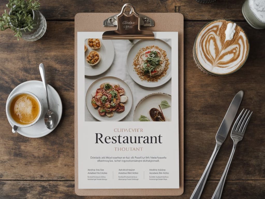
- Café/Restaurant: Textured paper, warm tones, menu highlight panel.
- Fitness/Wellness: Clean sans-serif, calming greens/blues, benefit-led hook.
- Real Estate: Photo grid (exterior, interior, map pin), clear contact block.
- Education/Workshops: Agenda bullets, speaker headshots, registration QR.
- Art & Galleries (Art flyer): Minimal copy, curatorial tone, striking visual centerpiece.
Short on time? Hand off your brief and get versions by tomorrow →
Print Specs (So It Looks as Good as On-Screen)
- Sizes: A5, A4, DL, or US Letter/half-letter.
- Bleed: 3 mm (or 0.125″) on all sides.
- Color: CMYK for print; export a separate RGB version for digital.
- Resolution: 300 DPI.
- File formats: Print-ready PDF + layered source (AI/PSD) + web PNG/JPG.
Quick Checklist (Pin This)
- ☐ One audience, one goal, one CTA
- ☐ Clear hierarchy (headline → details → action)
- ☐ High-contrast colors; readable from a distance
- ☐ QR code tested on real phones
- ☐ Print bleed/margins set; social crop prepared
Need a designer to QA your file before it goes to print? Get a preflight check →
FAQ
Flyer vs. Poster design, what’s the difference?
Flyers are for handouts or small placements; posters are larger and must be legible from afar. Share the same concept, but optimize hierarchy and scale.
Can I reuse the flyer for social?
Yes, export square and 1080×1350 crops. Keep the CTA and date visible within safe margins.
What’s the best font size?
Headline that reads at arm’s length; details at 9–12 pt for print. Always test-print a draft.
Ready to Launch Your Flyer?
Take the layout above, plug in your content, and keep the CTA crystal clear. If you’d rather skip the learning curve, pass your brief to a specialist and get polished assets ready for print and social.