Icons look tiny but they carry big weight for usability, branding, and conversions. In this guide, I’ll show you how I approach icon design from idea to export, share icon design inspiration, and add clear CTAs so you (or your clients) can move fast whether you DIY or hire a pro.
Hire a top-rated icon designer on Fiverr
Why Icon Design Matters (More Than You Think)
Great icons reduce cognitive load, improve navigation, and make interfaces feel polished. They’re also an easy brand “tell”: line weight, corner radius, and icon style choices say a lot about your product’s personality from enterprise crisp to icon cute and playful.
What a good icon set does:
- Communicates at a glance (no reading required)
- Feels consistent (same grid, stroke, and corner logic)
- Scales cleanly (from 16px favicons to 512px app store assets)
- Aligns with brand voice and icon aesthetic
Short on time? Get a custom icon pack tailored to your brand →
Start Here: Your Icon Brief
Use this to avoid endless revisions and ensure consistent icon layout and style.
- Project goal: e.g., “20 UI icons for a finance app”
- Style: outline / glyph / duotone / colored; note desired icon aesthetic
- Stroke & grid: e.g., 1.5px stroke on 24×24 grid, rounded caps/joins
- Corner radius: e.g., 2px for internal corners
- Metaphors: what each icon should represent (with examples you like)
- Boundaries: what to avoid (brand conflicts, over-detailed shapes)
- Deliverables: SVG + 1×/2× PNGs, naming convention, license
- Deadline & budget: include scope and revisions
Post your brief and get offers →
Icon Style: Choose Your Visual Language
Your icon style determines clarity and brand tone:
- Outline (stroke): Minimal, flexible, modern UI default.
- Glyph (filled): Strong silhouette, great at small sizes.
- Duotone/Color: Adds hierarchy and warmth; perfect for marketing and empty states.
- Skeuomorphic-lite: Subtle shading, gentle depth without heavy realism.
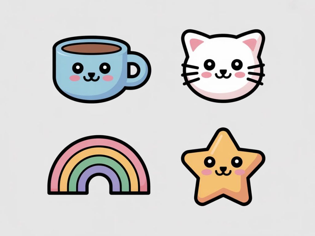
- **Kawaii/icon cute: Rounded forms, larger eyes (if characters), softer corners great for playful apps and education.
Pro tip: Define line weight, corner radius, and terminal rules once then apply across the set.
Icon Aesthetic: Make It Yours
Your icon aesthetic should echo the brand:
- Friendly: Round corners, softer curves, slightly thicker strokes.
- Techy: Sharper corners, geometric primitives, precise symmetry.
- Editorial: Thin strokes, nuanced proportions, high negative space.
- Playful: Exaggerated forms, subtle color fills, bubbly shapes.
Keep the silhouette simple. At 16–20px, detail gets mushy. If an icon needs labels to be understood, rethink the metaphor.
Match a designer to your brand vibe →
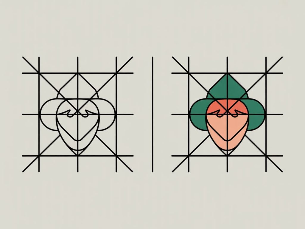
Icon Drawing: From Grid to SVG
A clean workflow keeps sets consistent.
1) Set your grid & keylines
- Common UI grids: 16×16 (compact), 20×20, 24×24 (standard), 32×32 (marketing).
- Draw within keylines (circle/square guides) for balanced proportions.
2) Stroke rules
- Choose one stroke weight (e.g., 1.5px on 24px grid).
- Use rounded caps/joins for friendlier tone; mitered for sharper feel.
3) Shapes > paths
- Build with primitive shapes whenever possible. It’s easier to keep symmetry.
4) Export-ready
- Expand strokes only when required. Keep a master with editable strokes.
- Snap to pixel grid where needed to avoid fuzzy rendering.
5) Naming
category_action_state.svg(e.g.,media_play_solid.svg). Future-you will thank you.
No time to draw? Order crisp, production-ready SVGs →
Icon Layout: Consistency Is Your Superpower
Layout rules prevent “wobbly” sets.
- Optical alignment: Center by eye, not just numerically (triangles & diagonals need nudging).
- Balance strokes and fills: Visual weight should feel equal across icons.
- Corner logic: Keep radius consistent; round internal corners slightly more than external for warmth.
- Padding: Leave equal breathing room in the artboard; don’t let shapes kiss the edges.
- Rotation & mirroring: Avoid arbitrary angles. Stick to 45° and 90° for clarity.
Have an expert QA your set before launch →
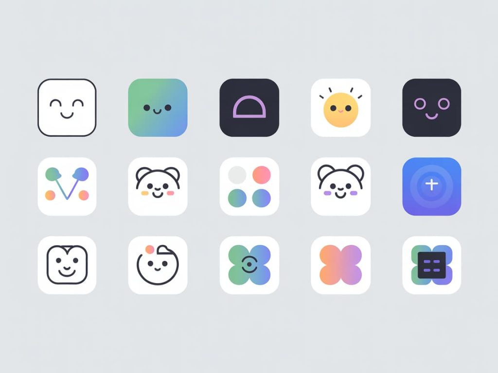
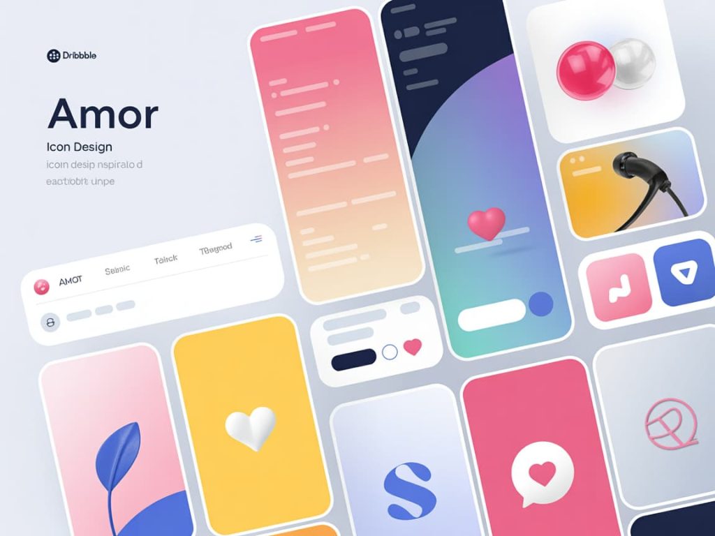
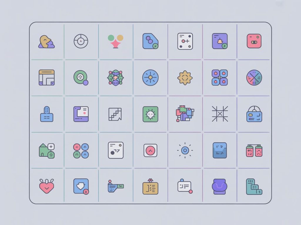
Icon Design Inspiration: Fresh Ideas to Jump-Start Your Set
Use these icon ideas to spark direction:
- Finance: vault, pie chart, receipt, shield-check
- Health: heart-pulse, pill, apple, yoga pose
- Travel: compass, ticket, suitcase-tag, map-pin-duo
- Education: open book, certificate-ribbon, lightbulb-note
- Productivity: calendar-spark, focus-target, lightning-bolt-task
- E-commerce: bag-heart, cart-add, tag-percent, box-delivered
- Social: share-arrow, reactions set (heart/sparkle/laugh)
- Smart home: thermostat, doorbell, smart-plug, sun/moon modes
- Dev tools: bracket-code, git-branch, server-stack, terminal
Want bespoke metaphors for your niche? Get 3 custom concepts in 24h →
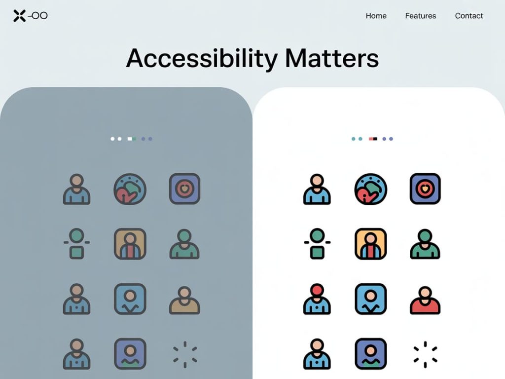
Color & Contrast: Accessible by Design
- Monochrome base: Start in one color. Add accent colors later.
- Contrast: Ensure filled icons maintain WCAG contrast when used as controls.
- States: Plan hover/active/disabled. Don’t rely on color alone; vary fill/outline too.
- Dark mode: Test both themes thin strokes may disappear on dark UIs.
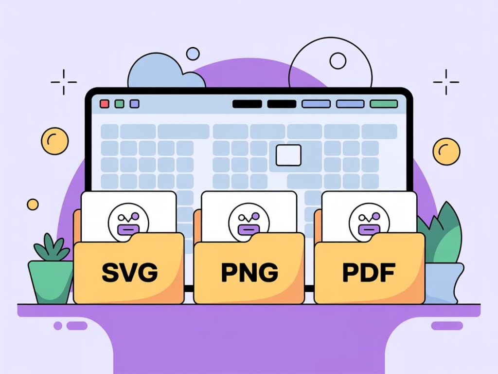
Export Like a Pro (So Devs Love You)
- Formats: SVG (primary), optimized PNG 1×/2× for legacy needs, and optional PDF for print.
- Bounds: Crop tightly; keep all art centered.
- Stroke expansion: Provide two sets if needed (stroked + expanded).
- Sprite or individual: Agree with devs early; name files for auto-import.
- Test at size: Preview at 16/20/24/32px in real UI mocks.
Short on bandwidth? Outsource the entire export & delivery pack →
Common Icon Mistakes (And Easy Fixes)
- Too detailed at small sizes → Strip to the essential silhouette.
- Inconsistent angles → Limit to 0°, 45°, 90°.
- Uneven stroke ends → Standardize caps/joins.
- Visual misalignment → Use optical centering, not just x/y values.
- Metaphor confusion → Test quickly: can a new user guess it in 2 seconds?
Need a quick audit? Book an icon review →
DIY vs. Done-For-You: What’s Faster for You?
- DIY is great if you already have a design system and time for iteration.
- Hiring a specialist pays off when you need speed, consistency, and production-ready files—especially for large sets or tight launch dates.
Browse vetted icon designers (ratings, portfolios, and delivery times) →
Quick FAQ
How many sizes do I need?
Design on a 24×24 grid for UI. Export SVGs and let the system scale. Provide PNGs for specific marketing needs.
Outline or filled?
Outline feels lighter and flexible; filled is better at tiny sizes. Many brands use outline by default and filled for active state.
What tools work best?
Figma, Illustrator, and Affinity Designer are all solid. The tool matters less than your grid, stroke logic, and consistency.
Can I mix styles?
You can but define rules. For instance, outline for navigation and filled for primary actions.
Ready to Ship Better Icons?
If you’re aiming for clean, on-brand icons that lift UX (and look great on Dribbble), use the brief above, lock in your icon layout and icon style, and keep silhouettes bold. If time is tight, hand the brief to a specialist and get back polished SVGs tomorrow.
Get your custom icon pack started now →
This post contains affiliate links. I may earn a commission if you purchase through my links at no extra cost to you.