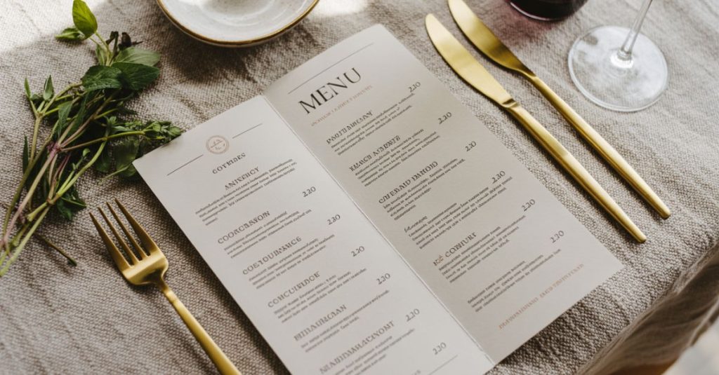
A great menu design is part psychology, part branding, and part clear communication. In this guide, I’ll share menu design ideas, creative layout tips, and menu design aesthetic choices that boost readability and orders. Prefer to skip the DIY? Use the CTAs to hire a pro in minutes.
Get your custom restaurant menu designed →
Why Menu Design Matters (More Than You Think)
Well-crafted menus increase average order value, guide choices, and elevate your brand. Typography, spacing, and imagery can nudge guests toward high-margin dishes while keeping the experience effortless.
Quick wins:
- One audience, one mood, one clear hierarchy
- High-contrast type and adequate spacing
- Photos used intentionally (or not at all)
- Strategic placement of signature dishes
Match with a top-rated menu designer →
Menu Design Inspiration (Creative Directions to Try)
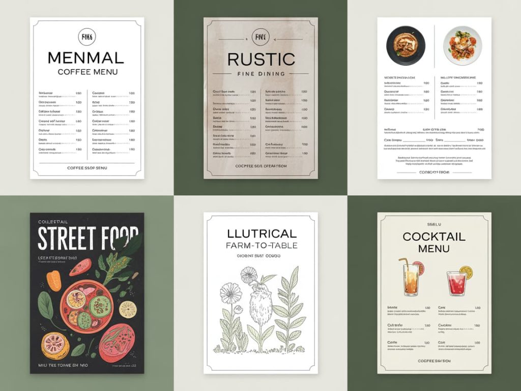
If you need menu design inspiration creative, pick a style that reflects your cuisine and audience:
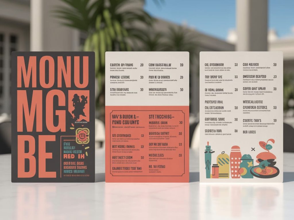
- Minimal Modern: Clean sans-serif, generous white space, fine lines perfect for upscale cafés.
- Rustic Bistro: Textured paper, serif headings, hand-drawn dividers.
- Contemporary Bold (cool menu design): Oversized type, color blocks, icon accents.
- Illustrated: Botanical or ingredient sketches for farm-to-table concepts.
- Global Street Food: Mixed display fonts, stamp motifs, vibrant palettes.
- Luxury Fine Dining: Delicate typography, metallic accents, rich dark backgrounds.
See curated portfolios for your cuisine style →
The Core Layout: A Reusable Structure
Use this framework as your menu graphic design blueprint (yep, people also search “manu graphic design”):
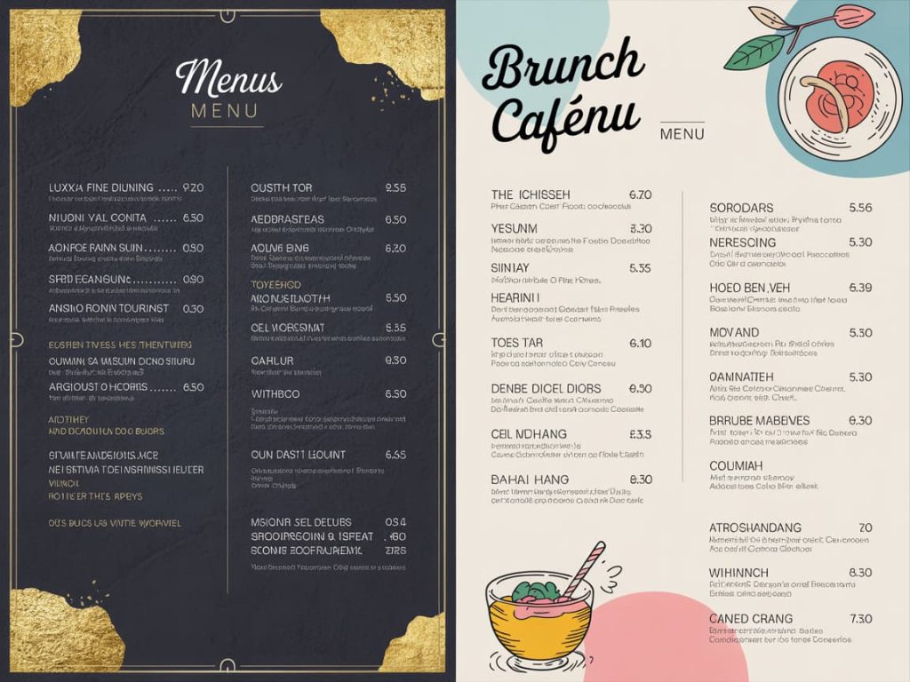
- Header Bar: Logo, location, hours or QR to full menu
- Category Grid: Starters • Mains • Sides • Desserts • Drinks
- Within Each Category:
- Dish name (bold)
- One-line description (benefit-first)
- Price aligned to the right
- ★ icon for special menu design items
- Spotlight Panel: Chef’s picks / seasonal board / tasting set
- Footers: Dietary keys (V, GF), service note, social handle
Have a pro set your grid and typographic scale →
Typography That Sells (and Stays Readable)
- Headlines: A distinctive serif or display sans at larger size
- Body: Highly readable sans/serif (avoid overly thin weights)
- Hierarchy: Weight + size + color (use one accent only)
- Spacing: 120–140% line-height; give every dish breathing room
Pricing Psychology (Without Feeling Pushy)
- Drop currency symbols where culturally acceptable (e.g., “18” instead of “$18”)
- Keep prices aligned for easy scanning
- Use decoy items to make hero dishes feel reasonably priced
- Bundle sides or add-ons in a “Complete the Plate” box
Get a profitability-focused menu revamp →
Imagery & Illustration
- Photography: Only if you can keep it premium and consistent. One photo per section beats dozens.
- Illustrations: Great for mood botanicals, line art ingredients, or small icons to separate categories.
- No imagery? Lean on paper stock, borders, and expert typography.
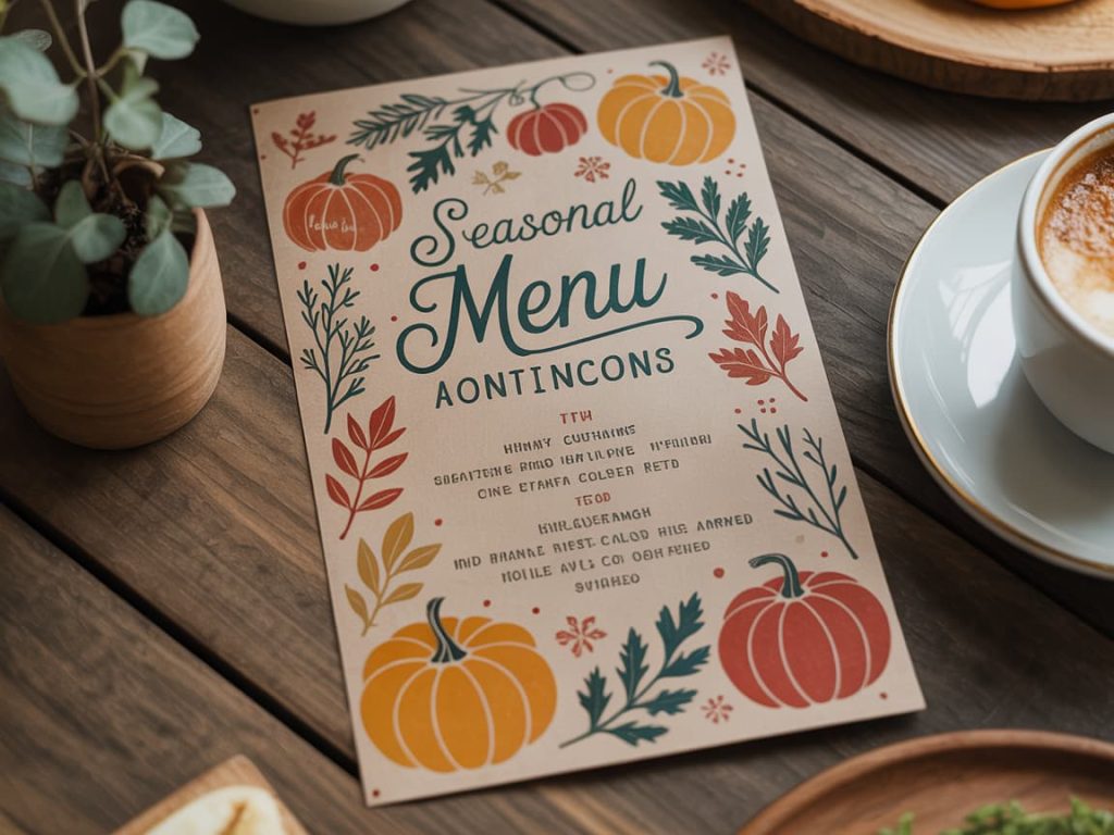
Menu Design Aesthetic by Venue Type
- Coffee Shop: Warm neutrals, simple icons, clear latte/size matrix
- Casual Dining: Friendly headings, subtle color code per category
- Fine Dining: Minimal text, poetic dish lines, tactile stock (linen, cotton)
- Food Truck/Street: High-contrast board, large pricing, QR to full menu
- Bar/Cocktails: Grid for classics vs. signatures, flavor notes & ABV
Need variations for brunch, seasonal, or events? Order a flexible menu system →
Special Menu Design (Seasonal & Limited-Time)
Create urgency and increase upsells:
- Ribbon “New” or “Seasonal” badges
- Limited-time box with 3–5 chef favorites
- Pairing suggestions (wine/coffee/dessert) beside dishes
- A small “Ask about today’s catch” note
Print & Digital Specs (Save This)
- Sizes: A4/Letter, long menu (DL), or tabloid for folded layouts
- Margins/Bleed: 3 mm (0.125”) bleed; consistent safe margins
- Color: CMYK for print, RGB for screens; keep brand colors consistent
- File Types: Print-ready PDF + editable source (AI/INDD/FIG) + web PNG
- QR Variant: Mobile-optimized PDF with larger type and tap targets
Get print-ready files and a QR version in one package →
Common Mistakes (and Easy Fixes)
- Too many fonts → Stick to 2 (headline + body)
- Low contrast → Increase color contrast and weight
- Crowded sections → Add spacing; split into subcategories
- Price ladder confusion → Align right; standardize decimals
- No focal point → Create a featured panel for high-margin dishes
Quick DIY Checklist
- ☐ Clear hierarchy (H1 > H2 > item > description > price)
- ☐ One accent color only
- ☐ Dietary keys explained once
- ☐ Signature items highlighted
- ☐ Proofread, print test, grease/lamination plan
Short on time? Hire a specialist to finalize and preflight your files →
FAQ
Should I include photos?
If they enhance trust and look consistent, yes. Otherwise, opt for illustrations or a clean typographic approach.
What’s the best paper?
Matte or uncoated for premium feel; laminated for durability in high-traffic spots.
How often should I update?
Quarterly for seasonal items; immediately for pricing changes. Keep a digital QR version for rapid edits.
Ready to Refresh Your Menu?
Lock your aesthetic, apply the layout framework, and highlight profitable dishes with tasteful emphasis. If you’d rather focus on service and the kitchen, pass your brief to a pro and get back a polished, on-brand menu.
