Great presentation design doesn’t just look good it makes your message unforgettable. In this guide, you’ll get proven presentation design layout frameworks, fresh presentation design ideas, and aesthetic presentation design tips you can use today. Prefer a done-for-you deck? Use the CTAs to hire a specialist in minutes.
Get a custom presentation designed for you →
Why Presentation Design Matters (More Than Fonts & Colors)
Clear visuals boost understanding, credibility, and conversion whether you’re pitching investors, teaching, or selling. Strong narrative + clean layout = more nods, fewer yawns.
Quick wins:
- One message per slide
- Clear hierarchy (title → key point → visual)
- Plenty of white space
- Consistent style across the deck
Hire a vetted presentation designer →
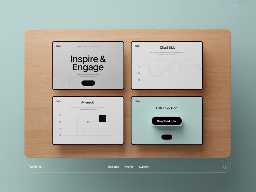
Presentation Design Layout: A Reusable Framework
Use this structure as your go-to presentation design layout (copy/paste):
- Title Slide – Big promise + subtitle (who/why).
- Agenda / Map – 3–5 beats (no laundry lists).
- Context – Problem in one visual or stat.
- Insight – What we learned / why it matters.
- Solution – Your approach in 3 parts (diagram).
- Proof – Metrics, case study, or demo frames.
- Plan – Timeline, phases, owners.
- Ask / CTA – Funding, sign-off, next step.
- Appendix – Details, backups, FAQs.
Get this layout built into a branded template →
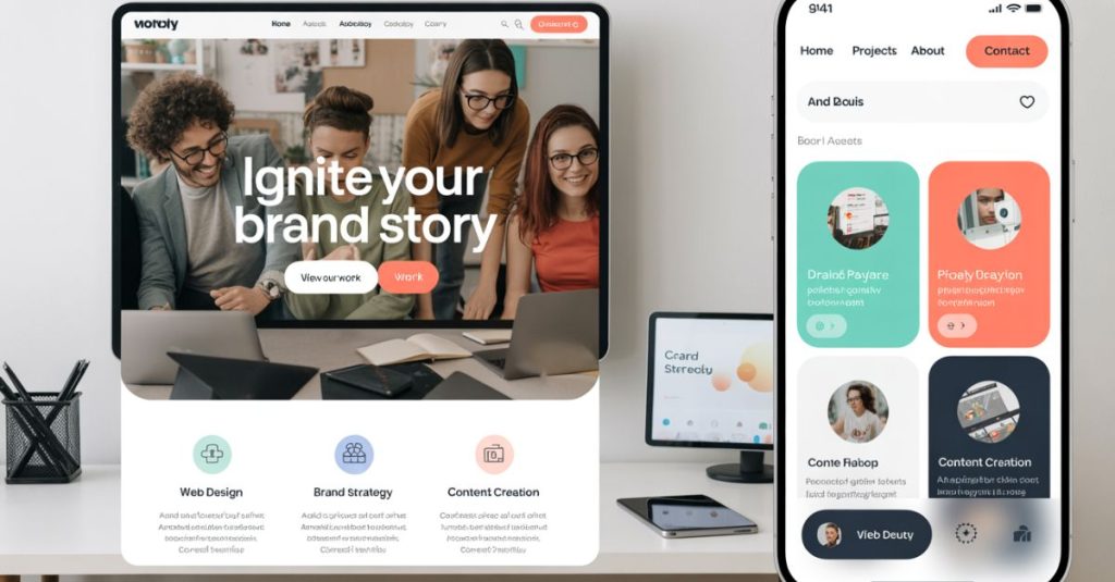
Presentation Design Inspiration: Styles That Work
When you need presentation design inspiration, start with a vibe that fits your audience:
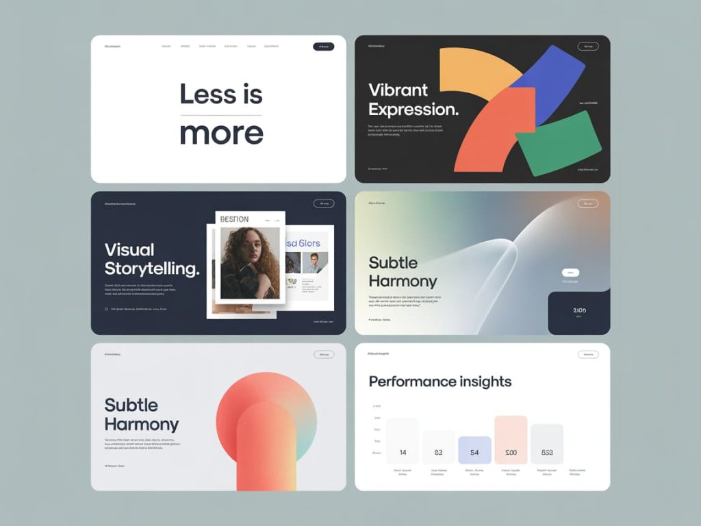
- Minimal Pro – Large type, monochrome with one accent, simple charts.
- Editorial – Magazine grids, image-led storytelling, classy serifs.
- Bold & Colorful – Full-bleed color blocks, oversized headings.
- Illustrated – Custom icons/diagrams for friendly explainer decks.
- Data-First – Clean charts, sparing color, rock-solid labeling.
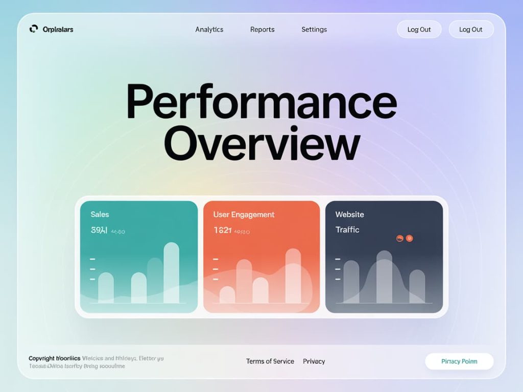
- Aesthetic Presentation Design – Soft gradients, glassmorphism, subtle textures.
See designers by style and industry →
Presentation Design Ideas (Slide-by-Slide)
Steal these presentation design ideas to elevate key slides:
- Opener: Big claim + striking image (or pattern) with 15–20 words max.
- Problem Slide: One chart with a single highlighted number; kill the paragraph.
- Mechanism Slide: 3-step diagram; each step uses a verb + icon.
- Case Study: Before/after panels with one metric per panel.
- Roadmap: Horizontal timeline with just 4 milestones; use verbs, not jargon.
- Team: Faces + one-line superpower; skip long bios.
- CTA: Action verb + deadline (“Start pilot this month”).
Have a pro turn your outline into visuals →
Aesthetic Presentation Design: Make It Cohesive
- Color: 1 neutral base + 1–2 accents. Reserve the brightest accent for CTAs.
- Type: Pair one display face for titles with a readable body font.
- Spacing: Use a consistent 8-pt scale; leave generous margins.
- Imagery: Pick one art direction photos or illustrations and stick to it.
- Icons: Same stroke weight and corner radius deck-wide.
Need a brand-matched deck system? Order a custom slide library →
Creative Presentation Design (Without Chaos)
Creativity is great if it serves clarity.
- Use pattern frames or soft shapes to group content.
- Animate only to reveal sequence or emphasize a point (no random fly-ins).
- Turn dense bullets into cards or step diagrams.
- Replace paragraphs with chart + caption or image + pull-quote.
Get motion-ready slides and presenter notes →
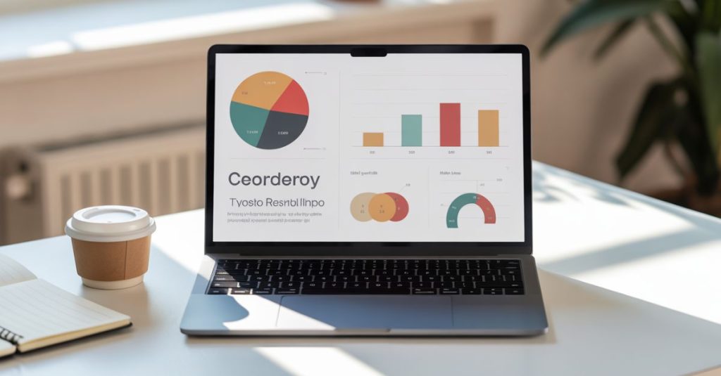
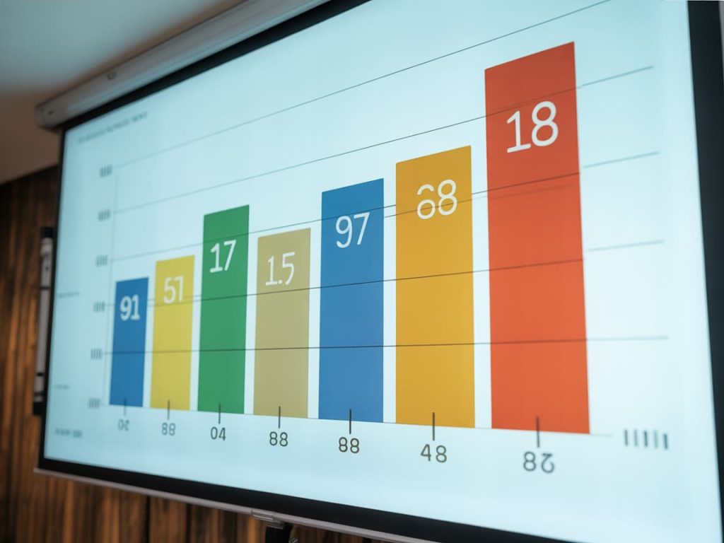
Charts That Don’t Lie (or Bore)
- Choose the right form (line for trends, bar for comparisons, pie sparingly).
- Label directly avoid tiny legends.
- Remove chart junk: 3D, heavy gridlines, unnecessary decimals.
- Highlight the one number that matters with an accent color.
Common Mistakes (and Easy Fixes)
- Too much on one slide → One idea per slide, split content.
- Inconsistent fonts/colors → Lock a theme and stick to it.
- Small text → Present at 16:9; test from 2 meters away.
- Wall of bullets → Convert to visuals (icons, diagrams, timelines).
- No CTA → End with a clear next step and deadline.
Short on time? Hand off your content, get a polished deck back →
Deliverables & File Tips
- Aspect: 16:9 widescreen.
- Export: PPTX/KEY + PDF (email-safe) + separate PNGs of hero slides.
- Accessibility: Sufficient contrast, alt text on key images, readable sizes.
- Templates: Master slides for title, section, 2-column, quote, chart, CTA.
Get a branded template pack + cover variations →
FAQ
How many slides is ideal?
As few as you can while keeping flow often 10–20 for a pitch, 25–35 for reports.
Should I use animations?
Only to control pacing and attention. Avoid novelty effects.
What about stock photos?
Use a consistent style; avoid cliché. Consider simple illustrations or diagrams instead.

Ready to Level Up Your Deck?
Lock your layout, choose an aesthetic, and let visuals carry the message. If you want conversion-ready slides (with charts, icons, and animations dialed in), a specialist can build it faster and better.